Jarod Spohrer

GD 122
this site the web

From Taste of Ink (R)
Clean, Simple, Professional, eye catching for some reason. It must be the uniformity with the one color dot of an i. like something that doesn't belong however doesn't destroy the unity of the logo. Also resembles the eye hole of a professional manila envelope or clasp button for a business brief 


From Mike Rock Design
The mix of WIS is interesting since at first you look at the Initials as WSI (Whitney S. Iles) However It could makes sense that using the last S in Iles could make the order of the graphic make sense. Either way using these ellements makes a classy interesting logo that I would associate quickly to the name. Also the ghosty mist in the background makes it more interesting.

From Logofavs.com (Professional Designer Community)
I enjoy the playful mix of the animal being the base of the tree as a small double take as you look as how it's put together and the character fits right in! While definitely looks mall like

From Professional Designer - Mike Rock 
Fantastic design for a building layout set brochure. The two right angles reference to the sharp corners you would expect to get with any building design layout when you are looking at the blueprints (below)


From Raja Studios 
Afuze Technology
Toronto IT firm with focus on centralizing 'fusing' technologies. The designer used something he'd seen in a colorfully designed report from a meeting of metallic fission and interpreted that into using a murcury baubles colliding together.  


From Taste of Ink(R)
The Florahaus logo was designed to brand a Floral Products company based in Australia. The mark is refined custom hand-drawn typography that conveys an organic and airy sense of happiness and effortlessness. The logo also subtly references the industry with the leaf illustration while maintaining a sense of cohesiveness. 

From designer Mike Rock
As if from Princton or another big name old school this logo fits right in with the classical caliber of schools with an old background and represents the school very well. Mix of Serif and San Serif fonts it highlights the elegant name of the school with the clear description below it.


From Taste of Ink (R)
AINA's logo mark is inspired by the frequent subject matter within the artist's work: rip curl waves and beautiful hawaiian foliage landscapes. The mark combines the wave and leaf, while hinting at the artist's lens. This logo mark is paired with custom adjusted letterforms for a cohesive logo that works with both image and word mark, as well as each piece standing strong solo.
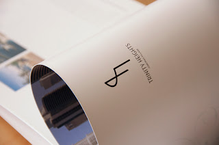
Designer Mike Rock - Trinity Hights brochure
For a mixed residential area in Dubai this clean logo is a nice mix of the letters T and H wrapped together and recognizable after seeing the name of the estate. Recognizable after that I like the simplicity and clean look.  


From Taste of Ink (R)
Business card samples for Nissan employees/dealership managers. I like the crisp design and using the car product on each of them and leaving no info save for logo and picture for front, saving it for the back. I think I will design my business card in a similar fashion.

From Logo Faves (Graphic Design Community)
Incorporating J from Jupiter and a horse head. A great mix for a logo design.

From the Taste of Ink
The Centurion Security logo features a custom-illustrated centurion guard encased in a shield form relating both to the company name, and the concept of security. A color scheme of gold and black adds an elegant touch. The hard serrif gives another touch of elegance at the same time solid.

Amazon
I just feel in love with this little guy from Amazons advertising. Simple to build in 3D and Character animate in poses. Definitively accomplishes recognizability to their company with their box being the head and for that matter making the entire character in their flexible size options to send packages. Their main goal is not just to get their logo out there and memorable but also to associate with the "cute" "nostalgic" emotion of when you think about someone far away and want to send something.. they want you to think of amazon first then that thought comes to mind.


From the Taste of Ink (R)
Helix Information Services' logo takes inspiration from the bold and innovative approach of their web development firm. The metallic bevelled forms with structured contours and sharp angles represent their dedication to perfection and their strong internal culture, also the double helix feature is recognizable enough for people to understand the reference to the gene structure.


From Raja Studios HolyWood Acting Studio Los Angeles based acting school with a strength in spirituality.


DESIGNER INSPIRATION:
"I had a vision of an angel bowing gracefully after a stage performance so I captured it."

Jarod: I like the simplicity of it while capturing the feature of an angel without being too identifiable. 
From the Taste of Ink (R)
The Avani Studios logo design incorporates refined modernism and artistic ability with a hint of professional appeal. The Avani Studios logo was designed to encompass a wide range of clientele and conceptualizes simplicity, clarity, and creativity. Clean gradients and soft tones for the color palette not only enhance the overall design of the logo but also provide Avani Studios with a distinct and competitive brand.
 

W3C Validations

Cum sociis natoque penatibus et magnis dis parturient montes, nascetur ridiculus mus. Morbi dapibus dolor sit amet metus suscipit iaculis. Quisque at nulla eu elit adipiscing tempor.

Usage Policies