Book:
100 Best in Design 2012
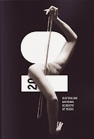
I looked at this image for awhile. Why? Because the body shape created it's own abstract image that seemed to be an instrument + a person playing it, all in one. Beautiful angles sweeping across while the lighting helps to balance areas to keep no one part of the body from standing out too much. Great resolution for putting type in with the picture with the 2010 being within it's self. 10 being more of a focal point and the inverse colored 20 as a "information" but still cleverly done as it is hidden behind the arm instead of standing out
Subscribe to:
Post Comments (Atom)

0 comments:
Post a Comment