Jarod Spohrer

GD 122
this site the web

Recent Photos

image
image
image

From Logofavs.com (Professional Designer Community)
I enjoy the playful mix of the animal being the base of the tree as a small double take as you look as how it's put together and the character fits right in! While definitely looks mall like

From Professional Designer - Mike Rock 
Fantastic design for a building layout set brochure. The two right angles reference to the sharp corners you would expect to get with any building design layout when you are looking at the blueprints (below)


From Raja Studios 
Afuze Technology
Toronto IT firm with focus on centralizing 'fusing' technologies. The designer used something he'd seen in a colorfully designed report from a meeting of metallic fission and interpreted that into using a murcury baubles colliding together.  


From Taste of Ink(R)
The Florahaus logo was designed to brand a Floral Products company based in Australia. The mark is refined custom hand-drawn typography that conveys an organic and airy sense of happiness and effortlessness. The logo also subtly references the industry with the leaf illustration while maintaining a sense of cohesiveness. 

From designer Mike Rock
As if from Princton or another big name old school this logo fits right in with the classical caliber of schools with an old background and represents the school very well. Mix of Serif and San Serif fonts it highlights the elegant name of the school with the clear description below it.


From Taste of Ink (R)
AINA's logo mark is inspired by the frequent subject matter within the artist's work: rip curl waves and beautiful hawaiian foliage landscapes. The mark combines the wave and leaf, while hinting at the artist's lens. This logo mark is paired with custom adjusted letterforms for a cohesive logo that works with both image and word mark, as well as each piece standing strong solo.
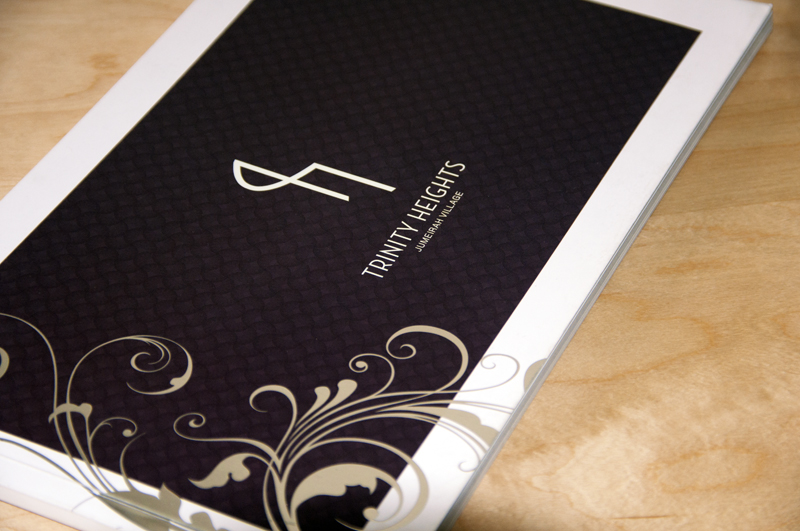
Designer Mike Rock - Trinity Hights brochure
For a mixed residential area in Dubai this clean logo is a nice mix of the letters T and H wrapped together and recognizable after seeing the name of the estate. Recognizable after that I like the simplicity and clean look.  


W3C Validations

Cum sociis natoque penatibus et magnis dis parturient montes, nascetur ridiculus mus. Morbi dapibus dolor sit amet metus suscipit iaculis. Quisque at nulla eu elit adipiscing tempor.

Usage Policies